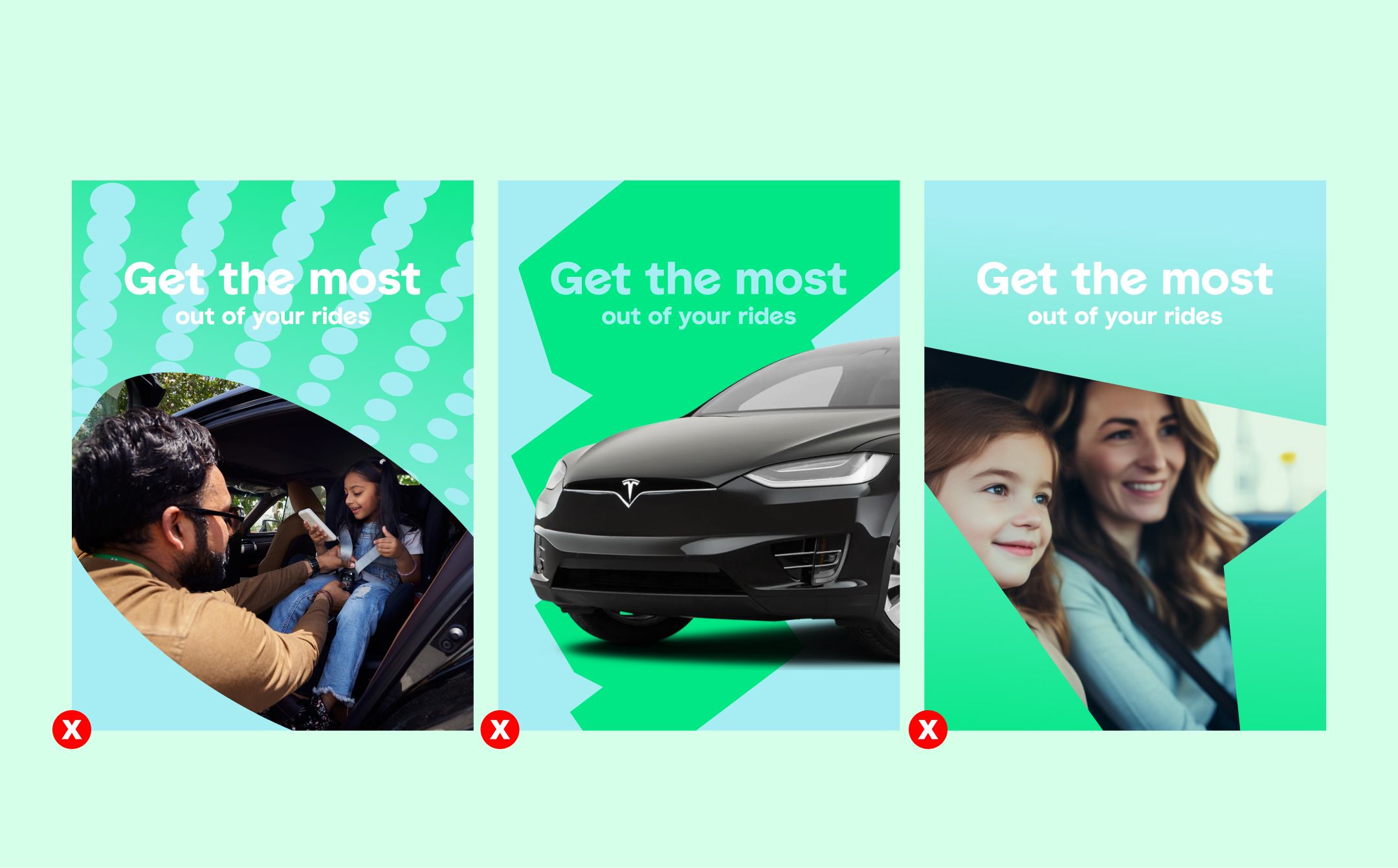
We use this style for our more serious services such as financial services, or when the copy is to appear with quiet confidence.
It can sit small in the middle centre aligned, or it can be left aligned tight to the top or bottom corners.
Our brand typefaces: ENGLISH
HEADLINE STYLES
Our headline styles allow us to use our brand in a more flexible way - ranging from the lower impact end (more sophisticates, quiet confidence) too more high impact (playful, expressive)
HEADLINE STYLE 1
We use this style for our more serious services such as financial services, or when the copy is to appear with quiet confidence.
It can sit small in the middle centre aligned, or it can be left aligned tight to the top or bottom corners.


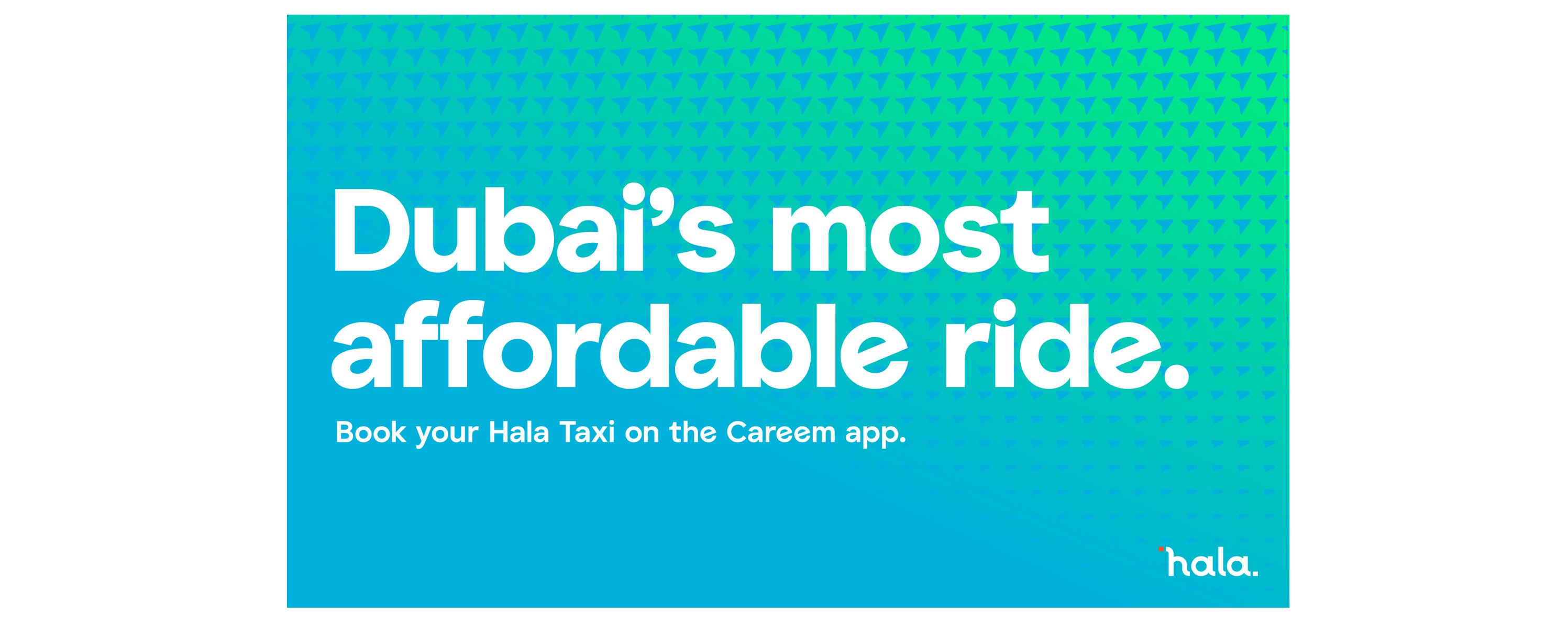
HEADLINE STYLE 2
We use this style for our bold statements and services such as our mobility services, or when the copy is to appear exciting. Text should always be left aligned.

HEADLINE STYLE 3
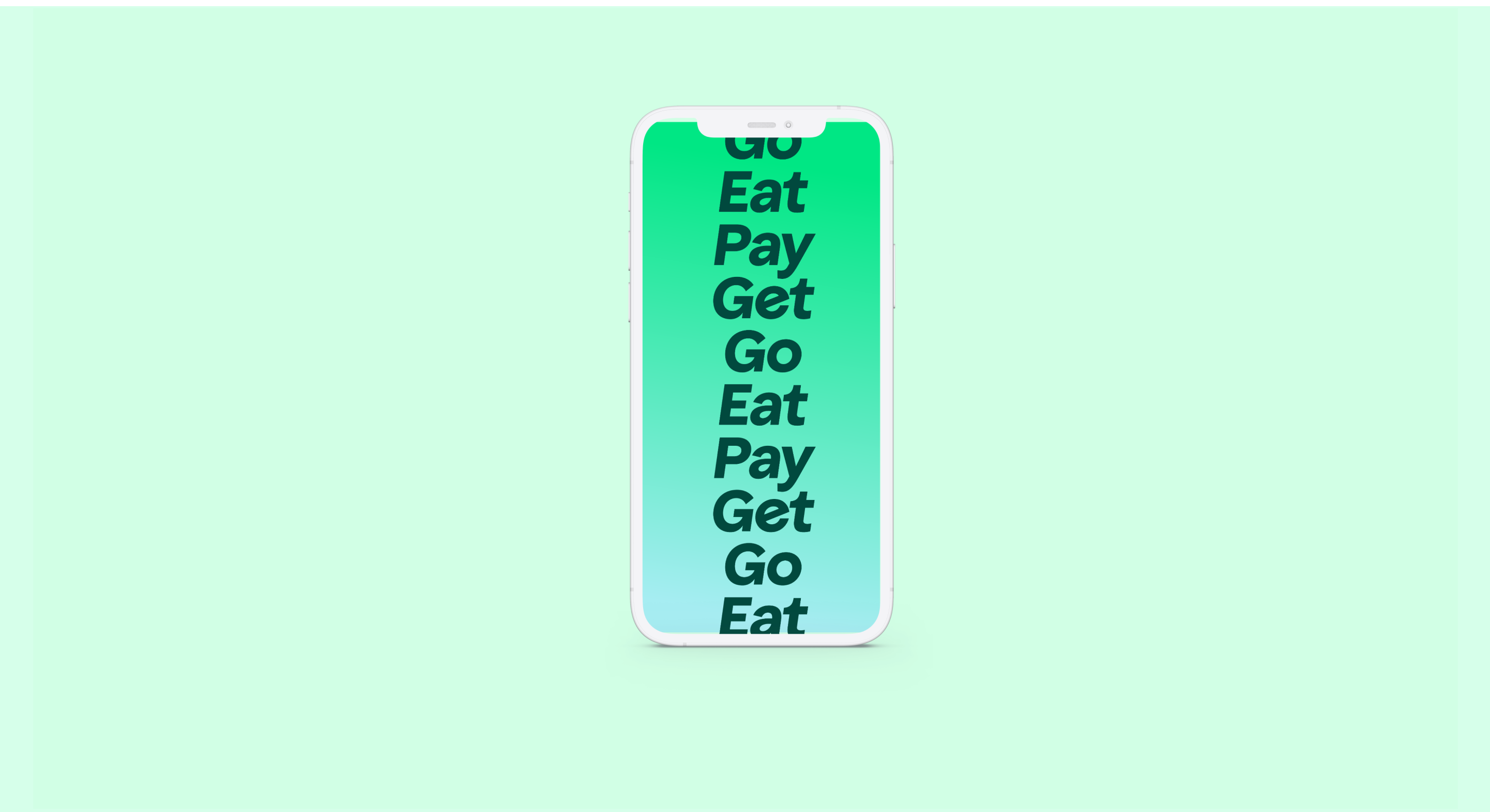
We use this style to create the most impact. If we have statements where we want to create emphasis then we make sure to italicise and scale up the word/phrase where we want to add the most energy and prescence.


HEADLINE STYLE 4

Type Heirarchy
Headline
Type: Bold slanted
Case: Sentence case
Kerning: Optical
Tracking: Optical
Leading: 85% – 100%
Headline
Type: Careem Bold
Case: Sentence case
Kerning: Optical
Tracking: Optical
Leading: 85% – 100%
Subheading
Type: Careem Semi Bold
Case: Sentence case
Kerning: Optical
Tracking: Optical
Leading: 85% – 100%
Bodycopy
Type: Careem Regular
Case: Sentence case
Kerning: Optical
Tracking: Optical
Leading: 100% – 110%
UI
Type: Inter Bold
Case: Sentence case
Kerning: Optical
Tracking: Optical
Leading: 100% – 110%
Type relationship
It’s important that we clearly follow this guidance to make sure we maintain a consistent relationship between our typography.
Functional typeface: Inter
Our typeface is a functional font which pairs nicely with our headline typeface. We have two weights so we can use it more flexibly.

System typeface: Jakarta
When we are not able to use our brand fonts, for example in systems which do not support additional fonts, we use a system font: Jakarta Sans.
THINGS TO AVOID
Do not use text colours over background that compromise legibility.
