Our layout system enables us to easily build compositions of varied sizes, using all our visual elements in a flexible, clear way.
Margins
Margins are determined by measuring the ‘x’ of the format and then dividing this by the number specified on the below examples.
Core logo placement and sizing
To determine the size of the logo, we use the longest edge of the format. Our symbol can be used as a sign-off or super graphic in secondary applications. In primary applications, the super graphic must be accompanied by the wordmark.
CATEGORY LOGO PLACEMENT AND SIZING: OWN CHANNEL
When we use our service lock ups in owned channel situations, we assume familiarity with the Careem brand, and can therefore use simply the container with the service name.
PARTNER AND MERCHANT PLACEMENT AND SIZING
Using the same sizing system as above, the partner lock up is placed on the bottom margin, juxtaposing with the Careem wordmark in the opposite corner shown by the dotted lines.
Plus logo placement and sizing
Our rules around placement and sizing for our Careem Plus logo follow the same principles as our core logo.
GRID
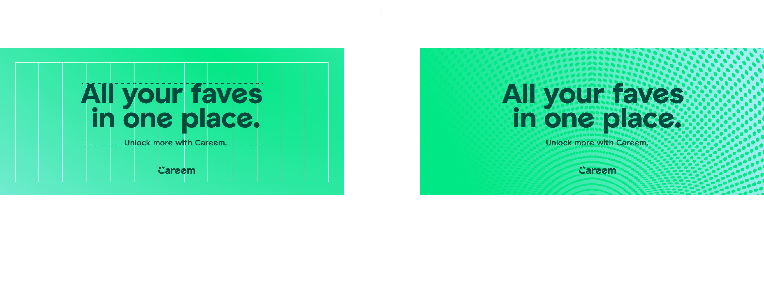
We use a 12 column grid across all applications except in extremely narrow formats, where we use a 6 column grid.
Making layouts: English
Below are examples of our layout system in use. The nature of our layout system is flexible and impactful.







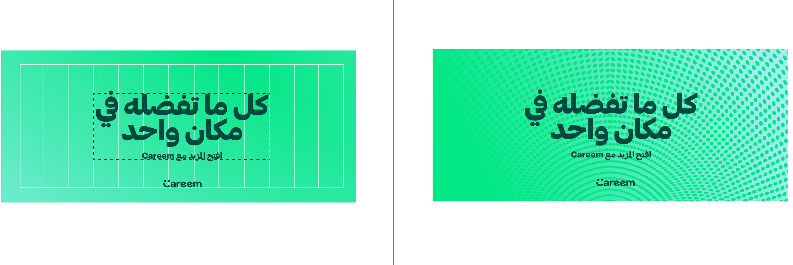
Making layouts: ARABIC
Below are examples of our layout system in use. The nature of our layout system is flexible and impactful.

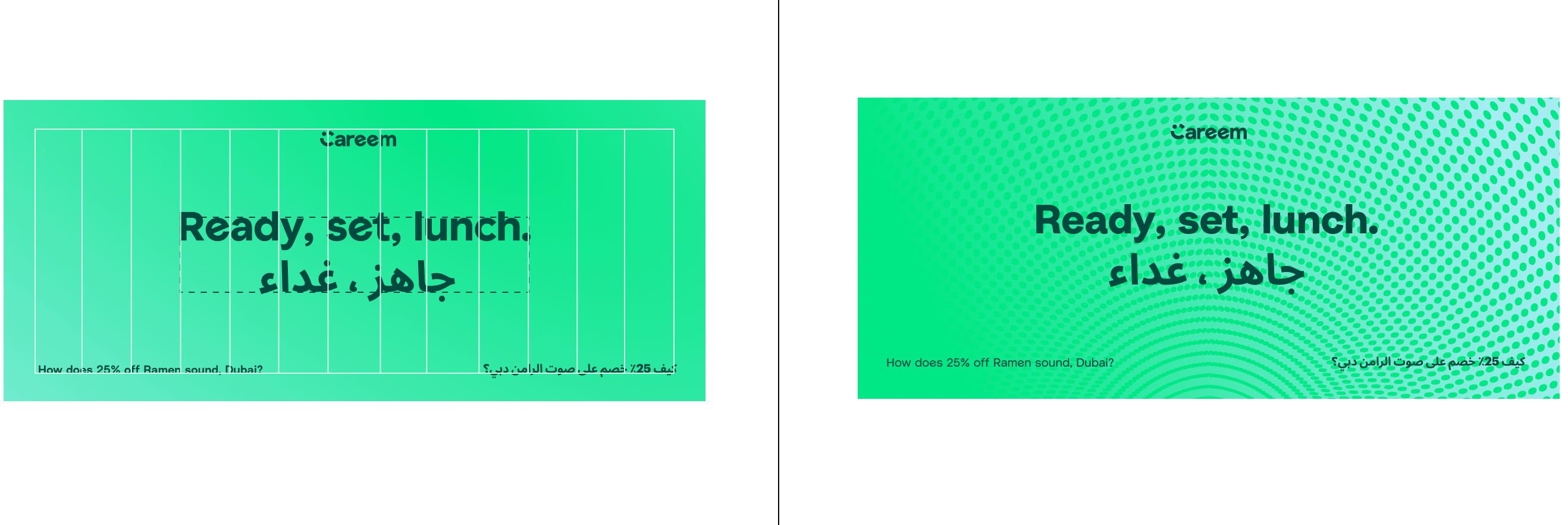
Making layouts: BILINGUAL
Below are examples of our layout system in use with two languages. The nature of our layout system is flexible and impactful - the type should follow the same principles as our other layouts but be re-adjusted to work in two languages.

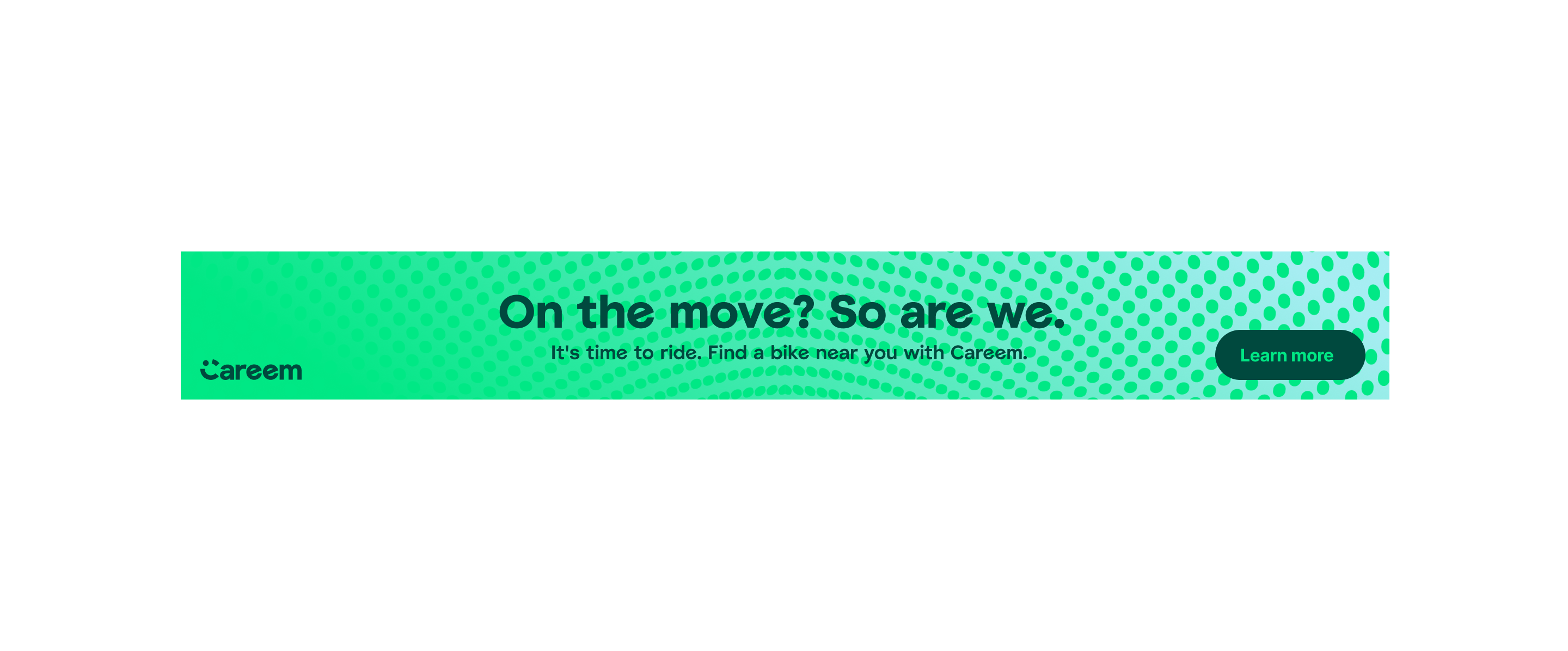
WEB BANNERS: LEADERBOARD
The same layout principles can be applied to our web banners in the same way.

WEB BANNERS: SKYSCRAPER


Web Banners: Medium Rectangle


The App Icon
The app icon must be applied in line with the Apple Guidelines. The below guidance helps ensure the icon is used correctly.