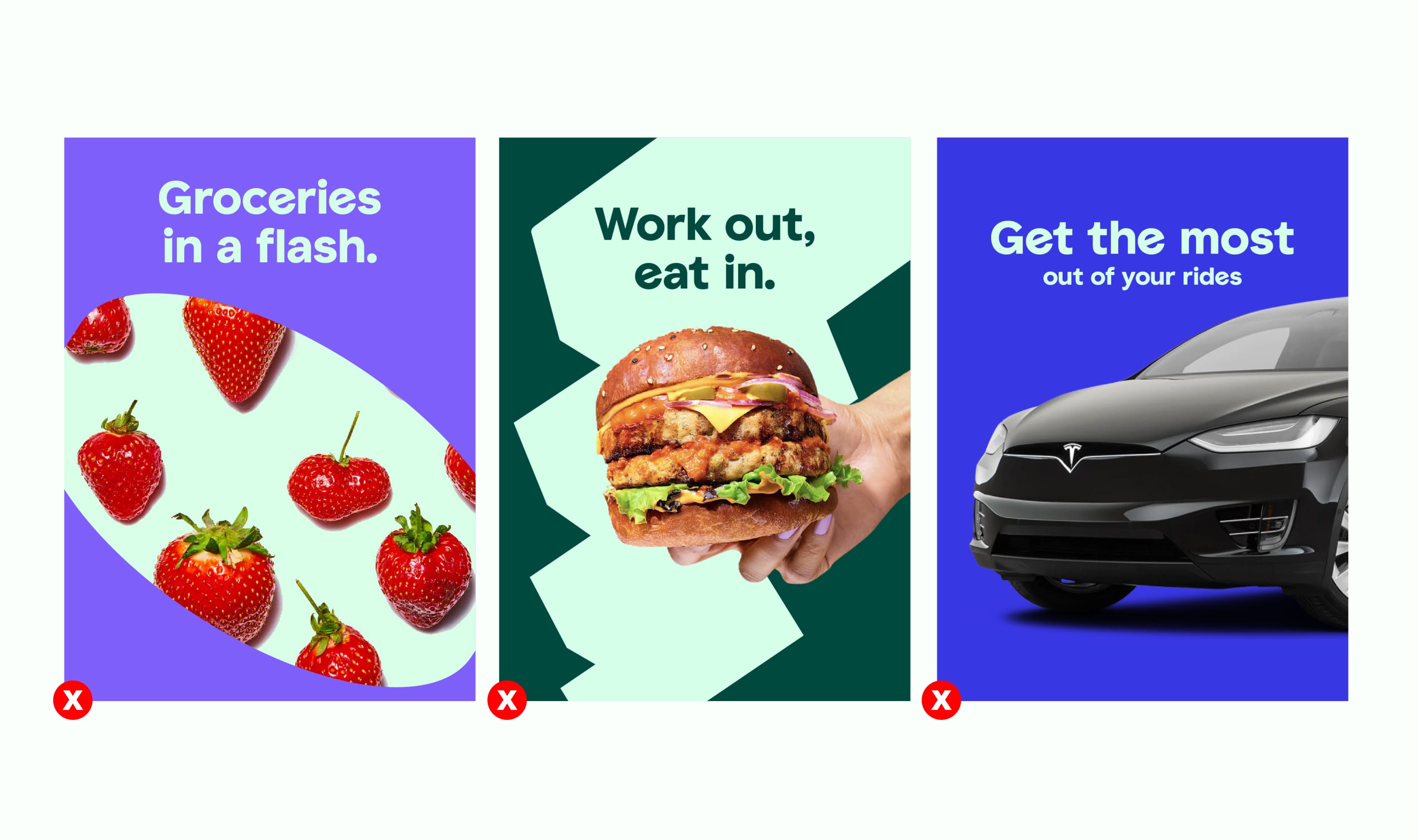
Our colour palette is ownable and fresh — setting us apart in the competition. It flexes across our entire brand and can be used in many different ways.
Core colour palette
Our core palette forms the foundation of the colour palette for our brand. All of the colours are designed to work together.
Careem Green
Pantone 7479C
RGB: 0 231 132
CMYK: 78 0 80 0
#00E784
Forest Green
Pantone 7729C
RGB: 0 73 62
CMYK: 91 42 69 49
#00493E
Light Green
Pantone 573C
RGB: 214 255 234
CMYK: 25 0 18 0
#D6FFEA
Desert Sky Blue
Pantone 635C
RGB: 166 237 242
CMYK: 36 0 11 0
#A6EDF2
Midnight Blue
Pantone 2766C
RGB: 0 25 66
CMYK: 100 88 15 41
#001942
Off White
Pantone N/A
RGB 250 255 252
CMYK: 3 0 3 0
#FAFFFC
Pantone 7729C
RGB: 0 73 62
CMYK: 91 42 69 49
#00493E
Pantone 7479C
RGB: 0 231 132
CMYK: 78 0 80 0
#00E784
Hierarchy of colour usage
This scale gives an indication of where to use certain colours and how much prominence they have within the brand.
USAGE:
Careem Green represents Careem at the highest level. It is used as much as possible as the core colour. It should also feature as a ‘green thread’ throughout our brand when other colours are more dominant.
Pantone 7479C
RGB: 0 231 132
CMYK: 78 0 80 0
#00E784
USAGE:
Our Forest Green is used for Plus but also as a contrast colour to our Careem green and lighter colours.
Pantone 7729C
RGB: 0 73 62
CMYK: 91 42 69 49
#00493E
USAGE:
Our Light Green is used in the same way as our Forest Green. We use it as a highlight colour and contrast colour as much as possible.
Pantone 573C
RGB: 214 255 234
CMYK: 25 0 18 0
#D6FFEA
USAGE:
Our Desert Sky Blue is another extension of our palette which allows us to create some beautiful gradients with our core ‘Careem Green’. We also use it as a highlight colour, but more sparingly.
Pantone 635C
RGB: 166 237 242
CMYK: 36 0 11 0
#A6EDF2
USAGE:
Our Midnight Blue is another extension of our palette which allows us to create some high contrast moments. We use it when we need to make text more deep and more legible on layouts.
Pantone 2766C
RGB: 0 25 66
CMYK: 100 88 15 41
#001942
USAGE:
Our Off White should be used in scenarios where the text is harder to read ontop of one of our core colours, such as our Core Green and Forest Green.
Pantone N/A
RGB 250 255 252
CMYK: 3 0 3 0
#FAFFFC
Secondary colour palette
Our secondary colours are category specific, and should only be used with services within the relevant categories. (Refer to architecture section for service categories)
Pay
Pantone 540C
RGB: 0 12 38
CMYK: 100 57 12 66
#000C26
Get
Pantone 2665C
RGB: 127 95 250
CMYK: 68 70 0 0
#7F5FFA
Eat
Pantone 7487C
RGB: 128 255 128
CMYK: 49 0 71 0
#80FF80
Go
Pantone 2736C
RGB 56 55 228
CMYK: 100 80 0 0
#3837E4
The Green Thread
The green thread runs throughout our touch points and the usage is defined by the customer journey.


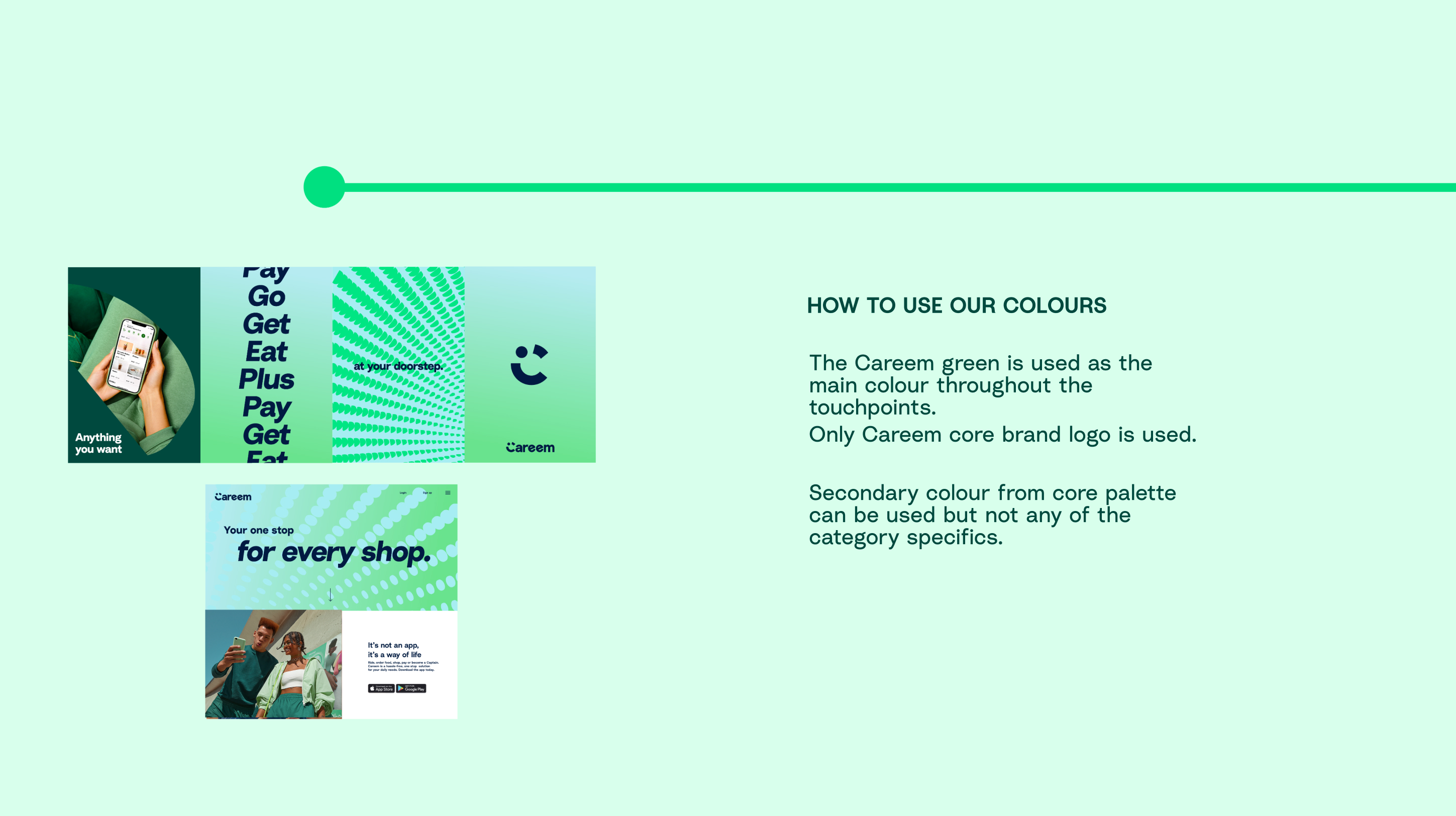

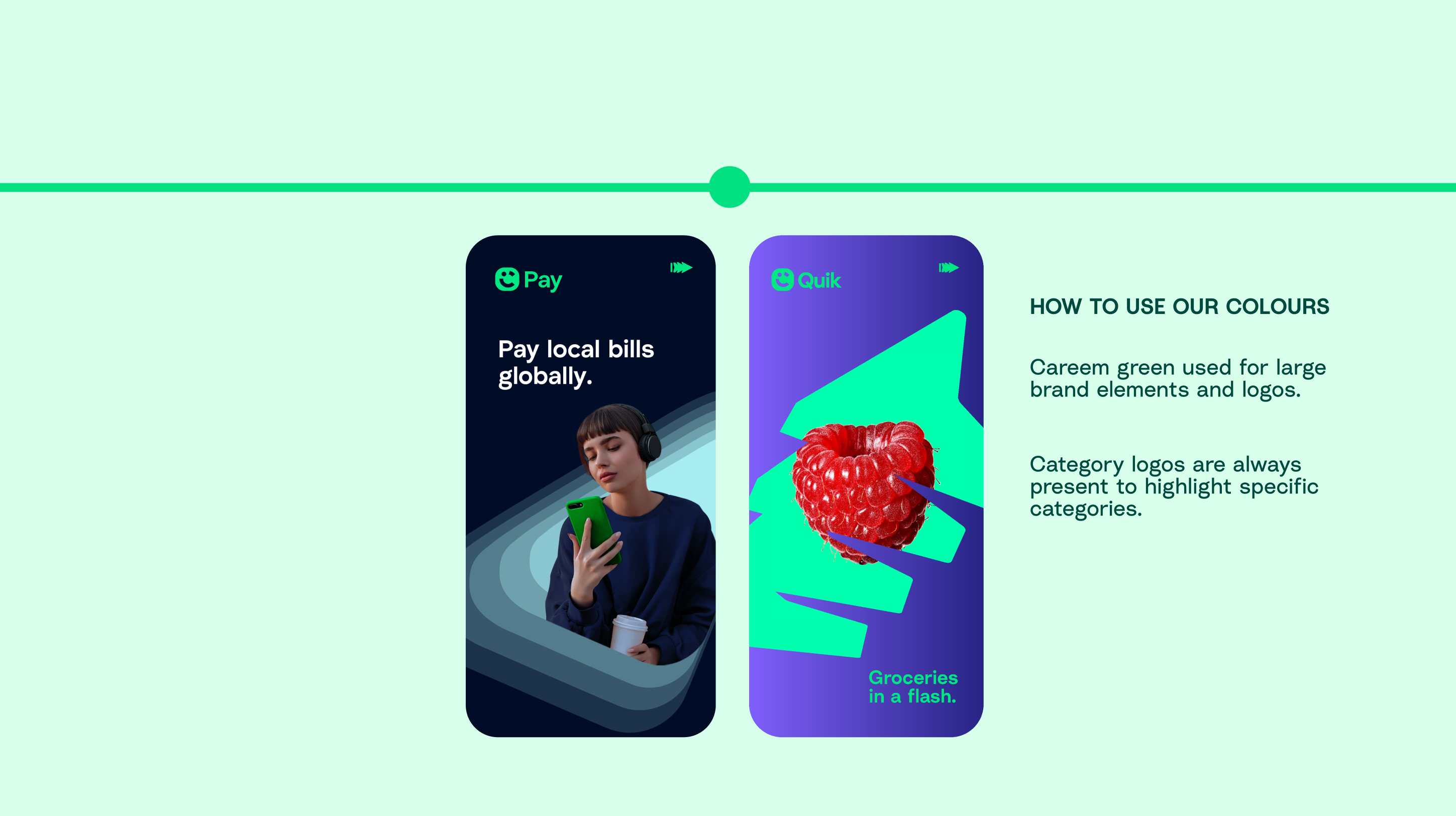


OVERVIEW
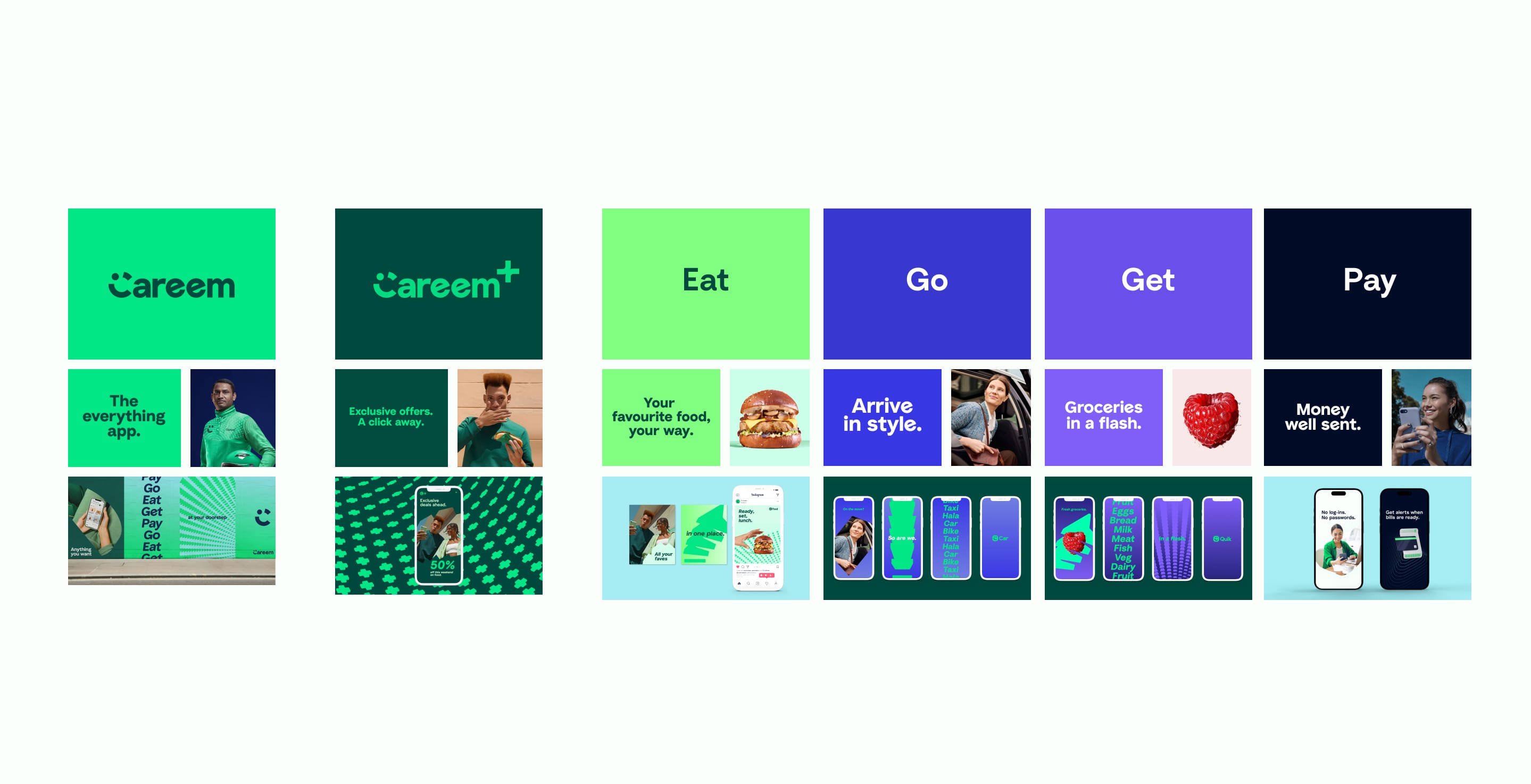
This is an overview of how we use colour across our Core and Category services.

Gradients: CORE BRAND
Our core gradient is used as the main background within our core brand. This is supplied in the downloads link as ready to use.



Tertiary Colour PALETTE
The tertiary colour palette has an extensive variety of shades to give us more flexibility when creating illustrations and icons. Its usage in both cases needs to be approved by Careem’s brand team, until illustration and iconography guidelines are released.
Some of the colours can also be used as images backgrounds – more information in Art Direction.
UI colour PALETTE
CORE UI PALETTE
Our core UI palette forms the foundation of the colour palette for our Super App. All of the colours are designed to work together.
SECONDARY UI PALETTE
Our secondary UI palette forms the foundation of the colour palette for our Super App. All of the colours are designed to work together.
Careem Green
#00E784
Midnight Blue
#001942
Purple
#855DFF
Desert Sky Blue
#A6EDF2
Red
#FF0040
Orange
#FB6704
UI colour palette usage
Our colour palette is used across our digital experience in many different ways.
CTA
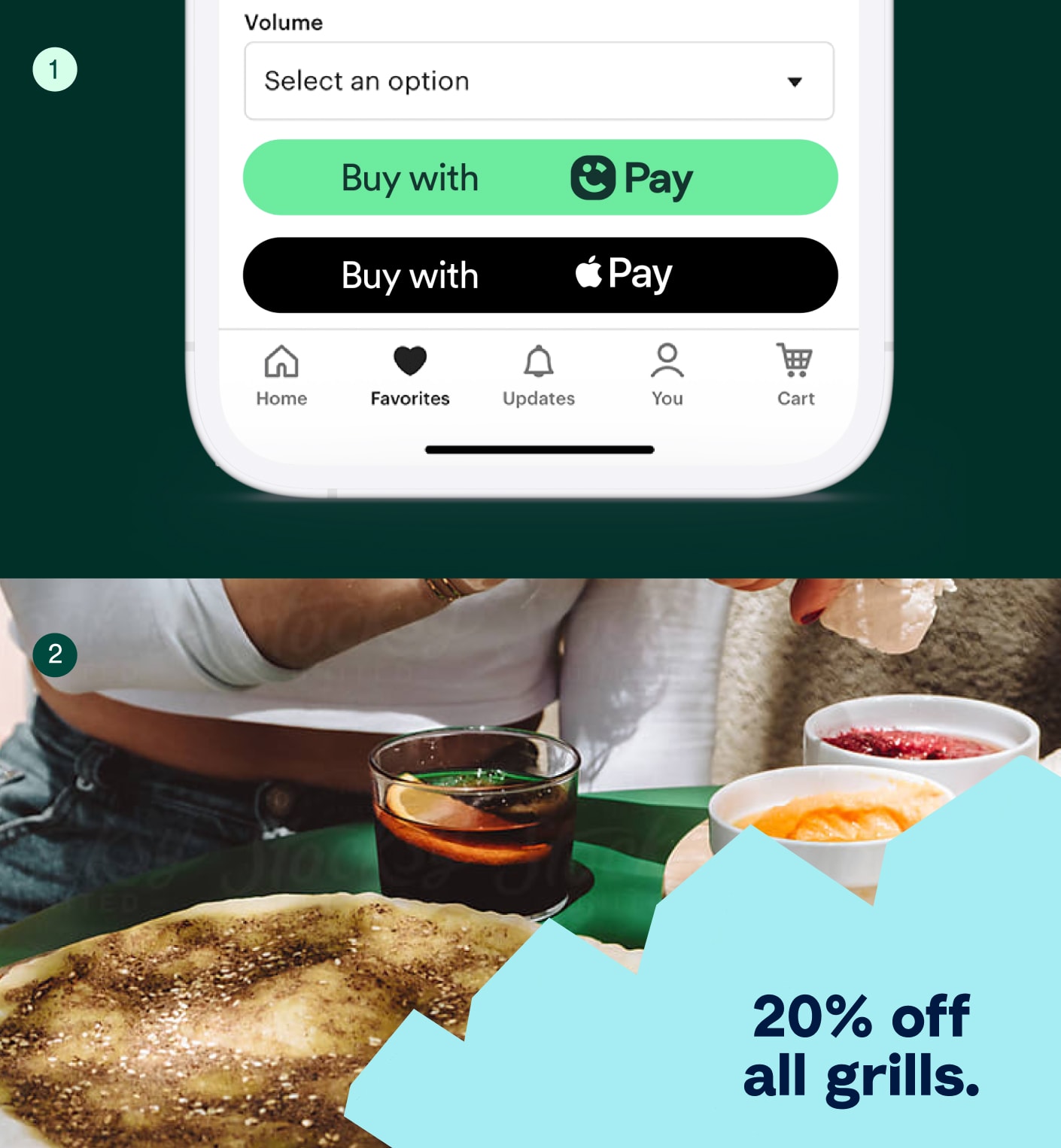
Our CTAs use our core green and become our ‘green thread’ throughout our digital experience.

Celebratory moments
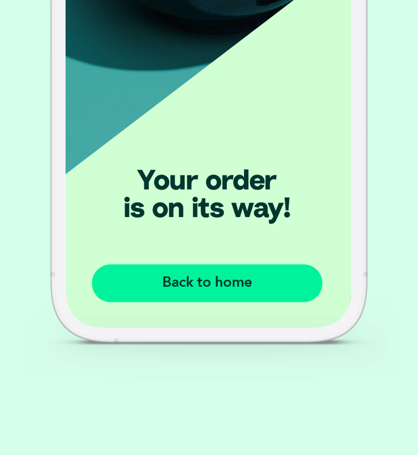
Our celebratory moments or splash screens use our graphic language in the correct category colour as a takeover. Our green thread is used on top for copy details and CTA.


Service tiles
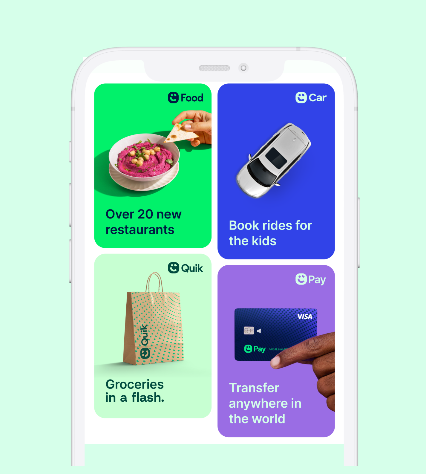
Our service panels use our graphic language when they are featured large scale within the digital experience, and have a ‘hero’ presence such as this example on the right.

Things to avoid
Never make a compostition without our core Careem Green
